
Redesigning the checkout experience
It came to our notice that the various versions of the checkout page offered by Cashfree across the various supported platforms had significant differences in both experience and look and feel.
This project started as an exercise into brining consistency across the various pages , but on further discussion with the stake holders , since there were going to be more features added a redesign of the checkout experience was deemed more prudent
Results of the initial design audit
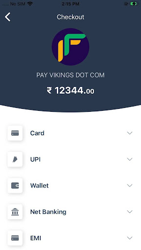
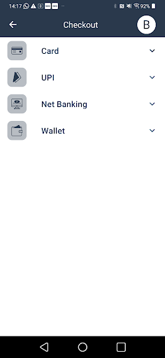
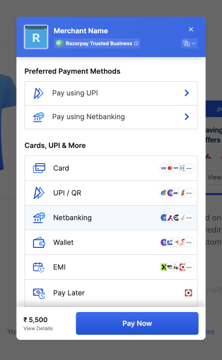
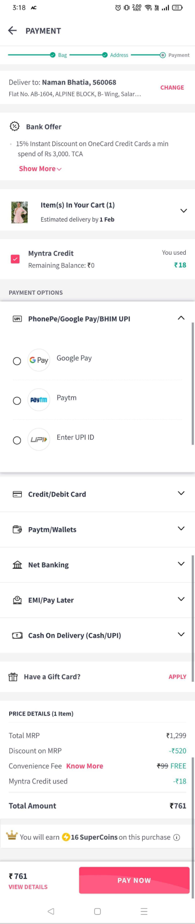
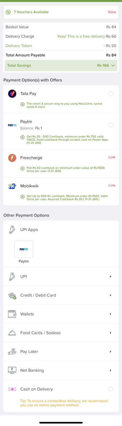
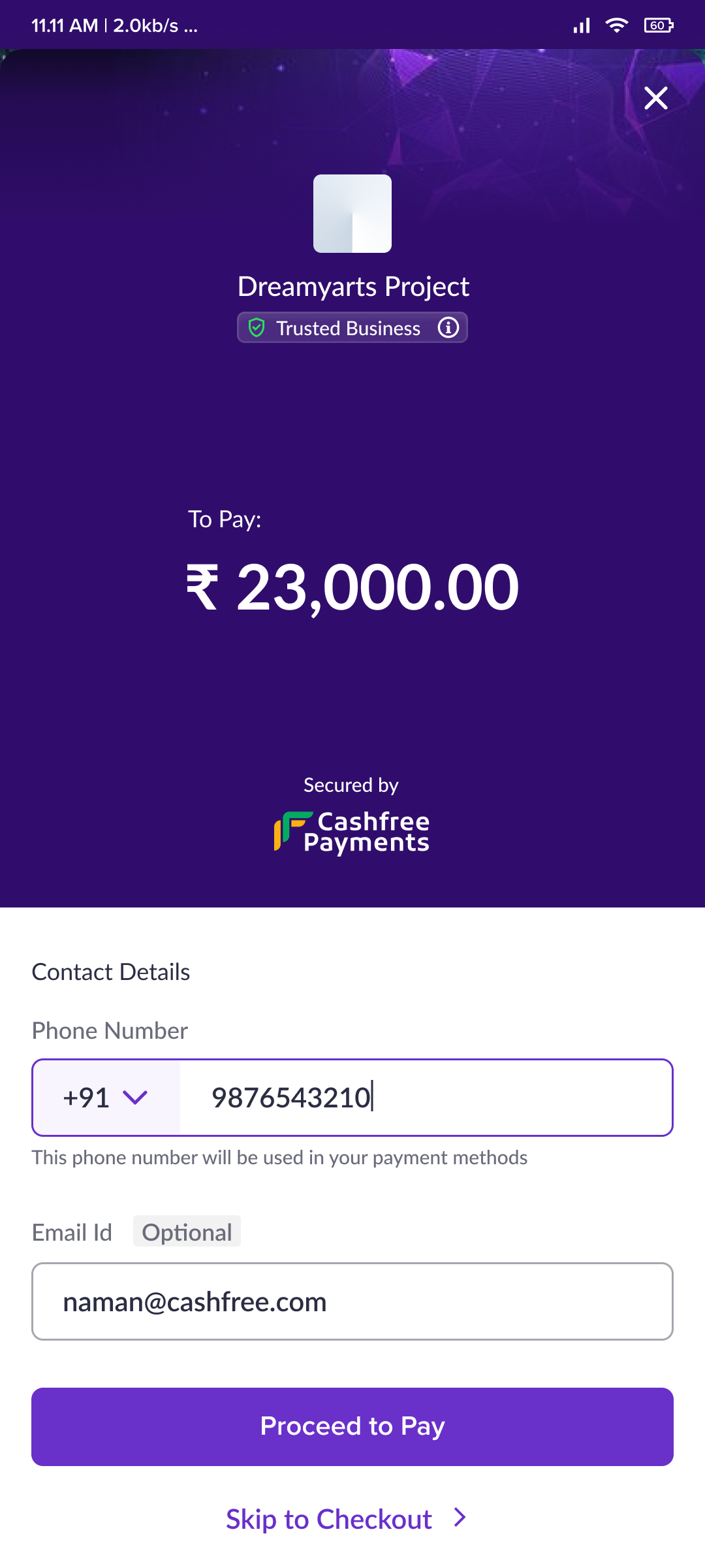
As a first step, a superficial design audit was done to evaluate the existing problems with the checkout across various platforms. This audit was largely limited to the landing screens across the various checkout pages.
Visual results:
- All icons are not same
- Icon holder styling is not same
- Header used to handle order details ( amount to paid ) in web and jsdrop but not in android,ios , (when payment method is selected or user scrolls , then amount disappears and appears in the pay button )
- Header format and content are different across all platforms
- Footer not present in mobile apps or js drop, but present in web checkout
- Close opens carets are not the same across platforms , similarly the back button is not the same
- Logo sizes are not the same
Experience / Behaviour results :
- Js drop uses global pay button, web,android and ios uses local pay button ( as mentioned before android,ios use button to show amount )
- Web opens first payment method by default
- Android and ios have scroll up animation, while web and js drop have no scroll behaviour (this is a problem in ios as there is an semi-scrolled indeterminate state, where the user has no idea of amount to be paid.)
Other thoughts :
- All the interfaces looked a little dated
- The expand / collapse approach was not ideal for more intricate payment methods
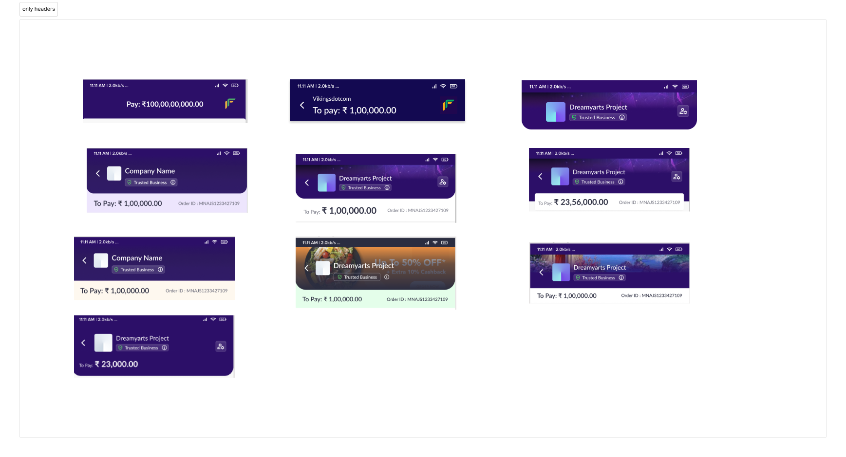
Initial Designs
The initial designs were a small aesthetic overhaul, we just wanted to make the checkout look more modern. Various options were explored, as shown in the image below.
Some learnings from the initial explorations
We learnt a lot form our initial explorations, and these were some of the final takeaways.
- Grouped cards are more efficient space wise
- Having the amount in the header helps set context more easily
- Merchants want the checkout to reflect their branding more, it has to be more customisable
- The footer is a vital location and should be used for actions, and showing information just before confirming payment ( Can be used to build confidence )
Radical approaches not explored in totality
As part of our explorations into checkout layout , there were 2 radically different approaches that we felt had some merit.
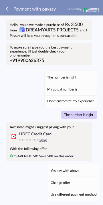
Paysay : A chat interface for payments
We explored completely replacing the landing page with a chat experience.
Advantages
- Chat allows for multiple options without being overwhelming
- Can be easily integrated into social media/chat platforms like whatsapp etc to allow for a more native payment experience
- Easier to localise into multiple languages
- Screen reader friendly
Disadvantages
- On web interfaces and desktop the chat option would work only in popups or iframes and would not be ideal for full page redirections
- Maintaining context in a chat like interface is hard, ( but it can be attempted )
- Checkout pages are not expected to be chat boxes
Instapay: Using a horizontal scroll to navigate between payment methods
We explored completely replacing the vertical page with a horizontal page.
Advantages
- Horizontal page allows for easy changing between payment methods
- Standout approach that no other competitor has taken
Disadvantages
- Horizontal scrolling is not optimised for older desktops and browsers
- Chance of checkout action being confused with global action gestures ( like back on mobile devices )
- Uncertainty over universal recognition of horizontal scroll paradigm
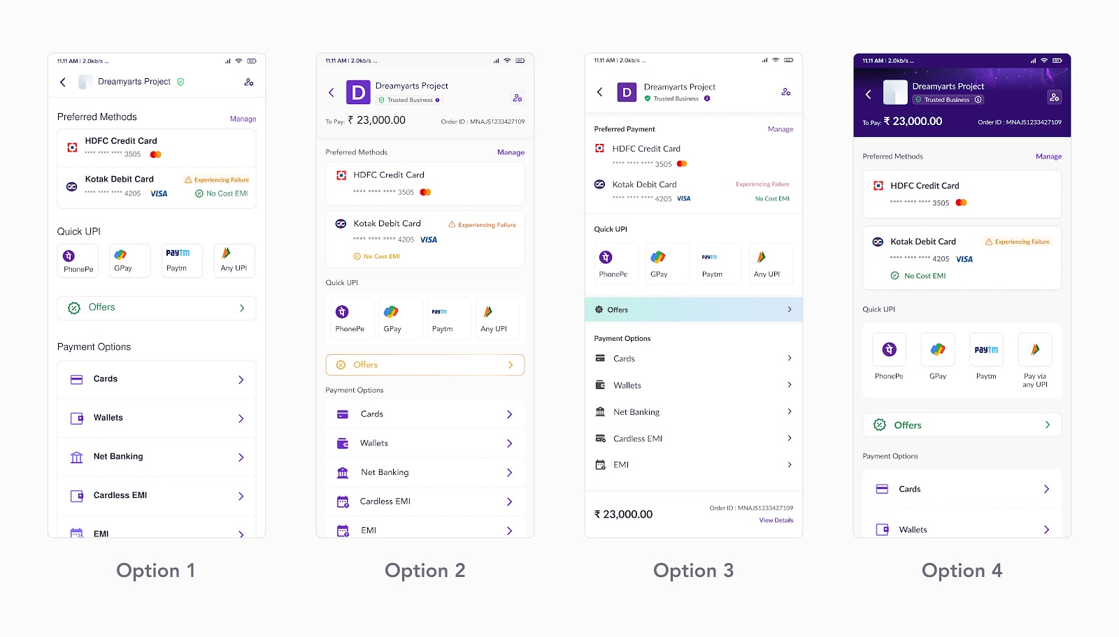
Mid Process Designs
The mid process designs, were when we had a lot more clarity of both the aesthetic we were working for and the information we wanted to show . The final designs were derivatives of these and a lot of the aspects were kept
Competitor analysis
Once we had our base set we looked at our competitors to benchmark our approach .
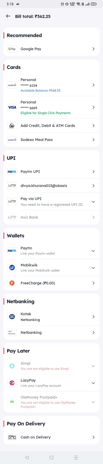
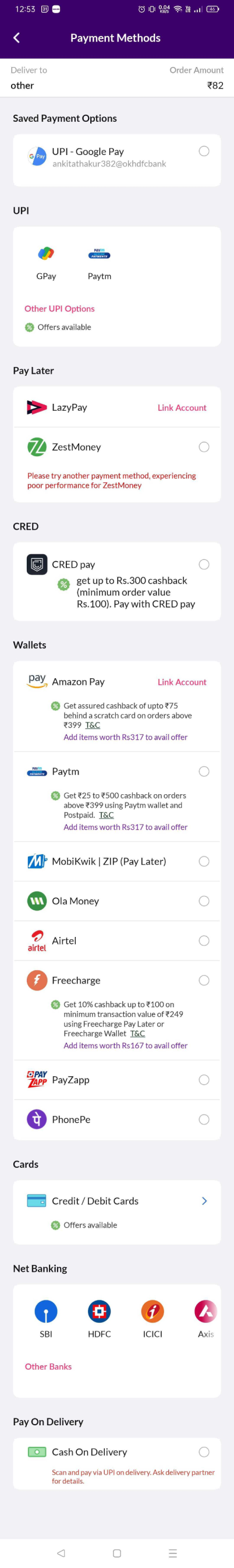

- Our layout was similar to most of our competitors.
- Some competitors did use separate pages for individual payments.
- Horizontal scroll options were rarely used
- Competitors with multiple payment methods, broke them into cards
- UPI was a main focus for many competitors
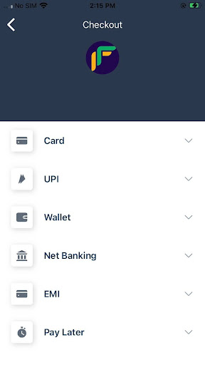
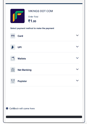
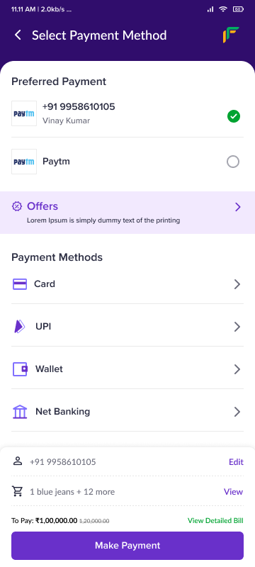
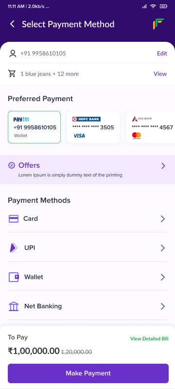
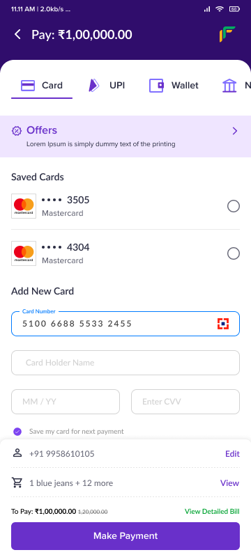
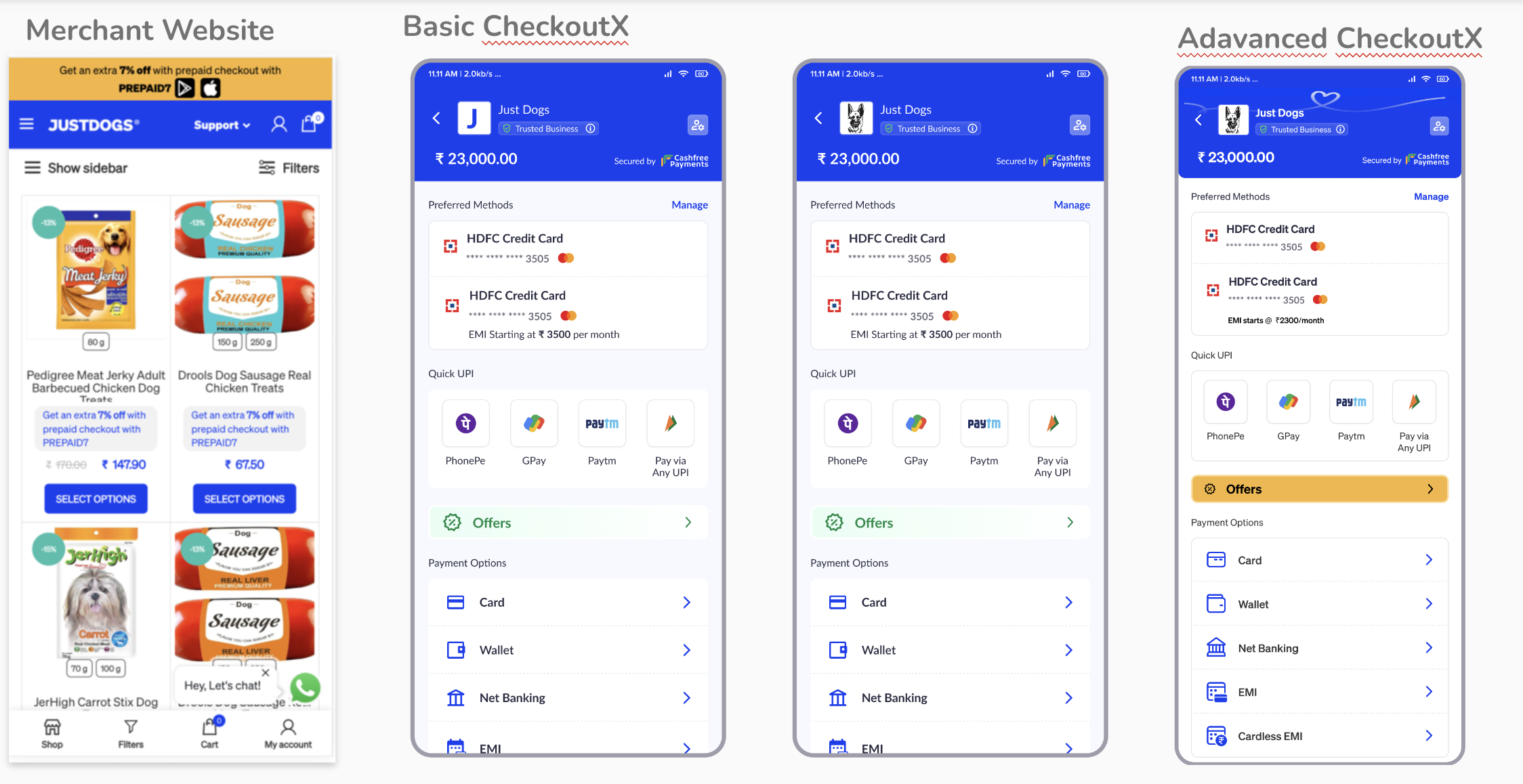
Near final design
We took our mid level approach added some more polish , added other required information and a little more polish.And we got our near final designs
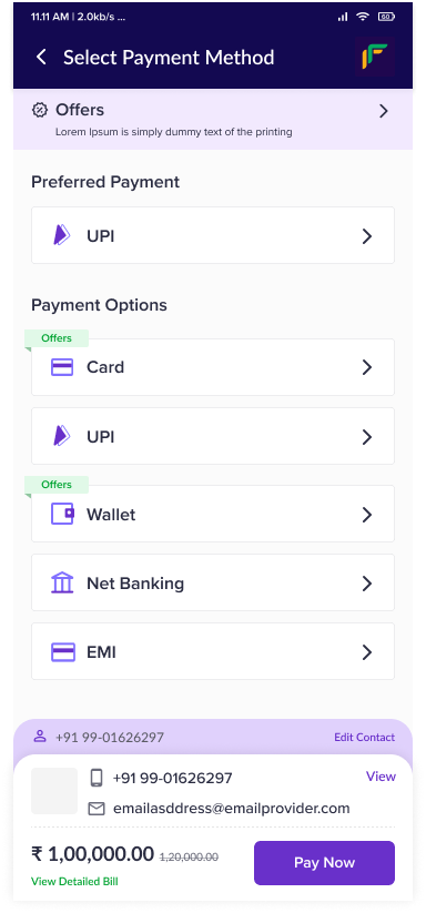
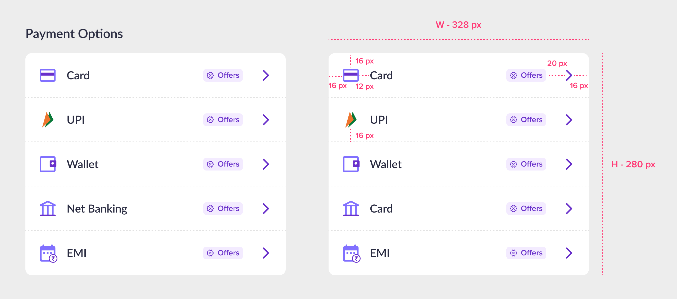
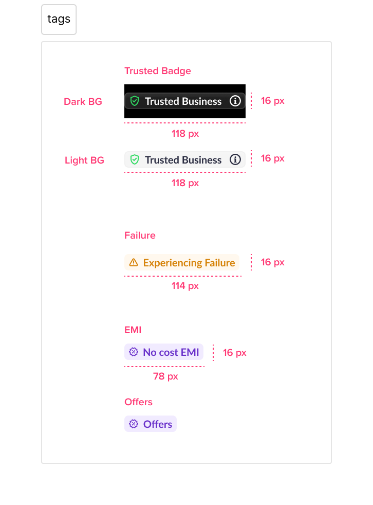
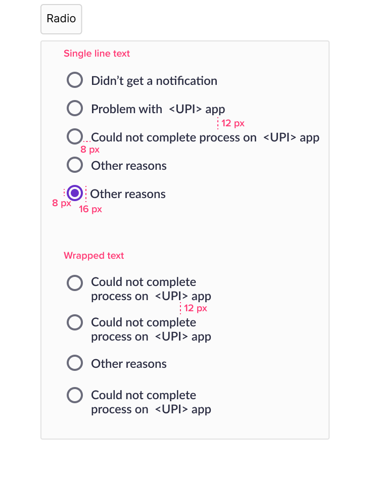
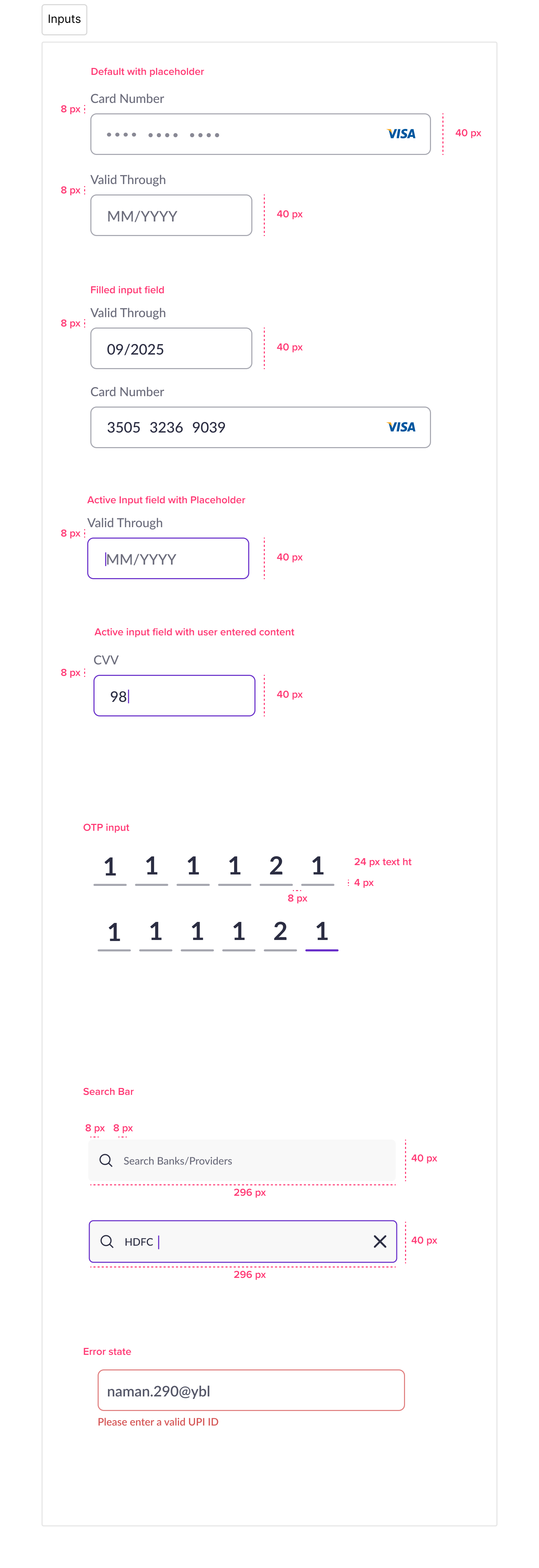
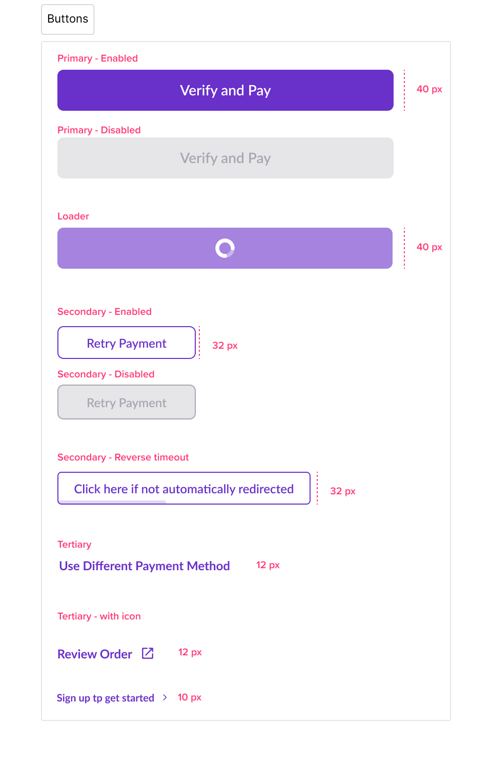
Design system for checkout
Since our design was nearly final we created a design system dedicated to checkout, so that all subsequent pages ( dedicated to payment methods ) are consistent
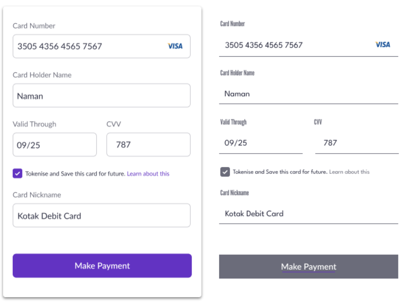
Evolution of the header
Just to show the change in information, and how the design evolved and some of the nuanced decision making that was needed . The following image shows how the header evolved. From first to final design
Final design evaluation
Since the checkout is so significant we created 2 alternate versions of checkout and did as final user test to ensure that our designs were right. Our design was selected as superior by 66 % of those polled
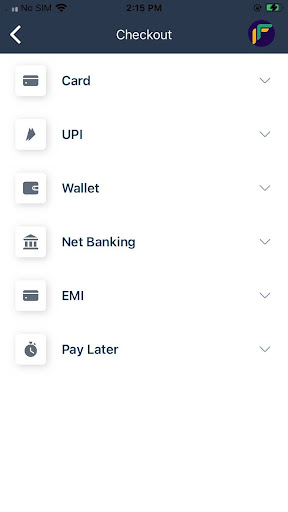
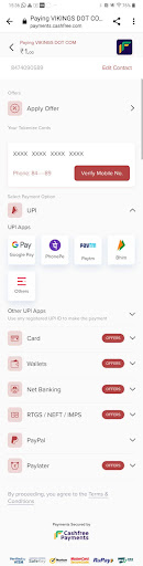
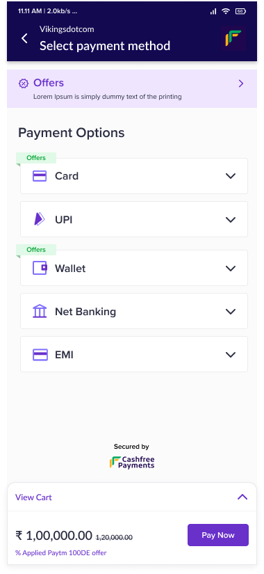
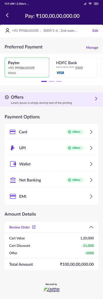
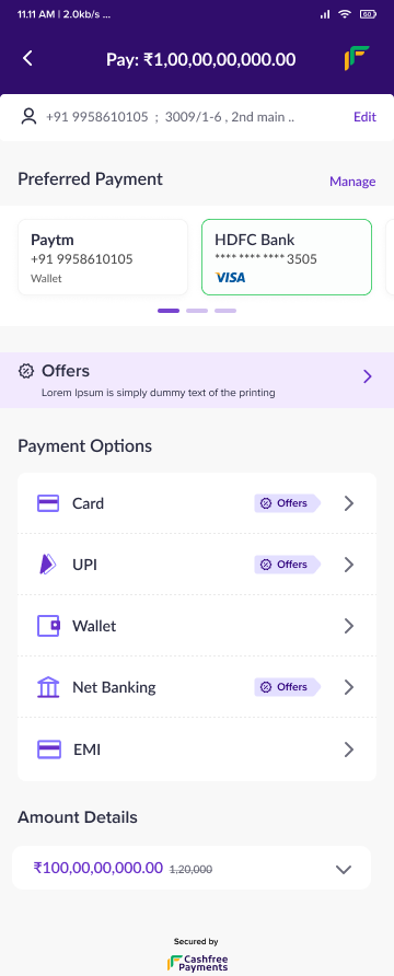
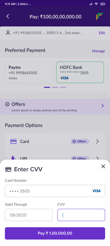
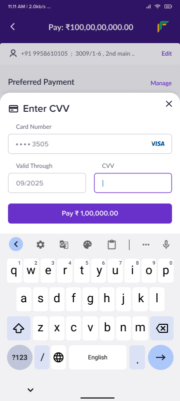
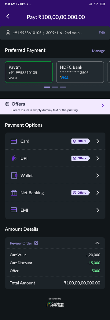
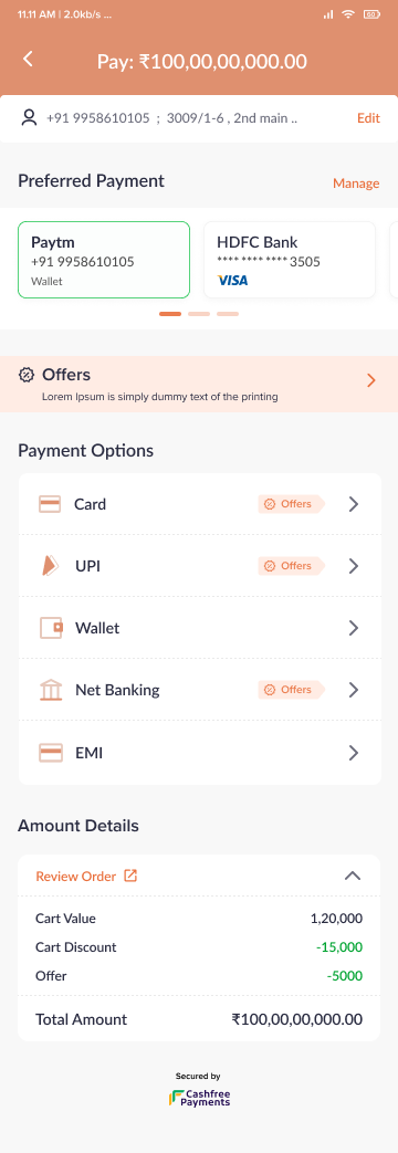
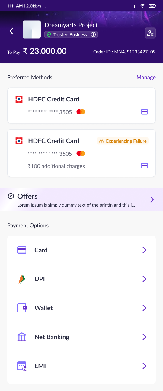
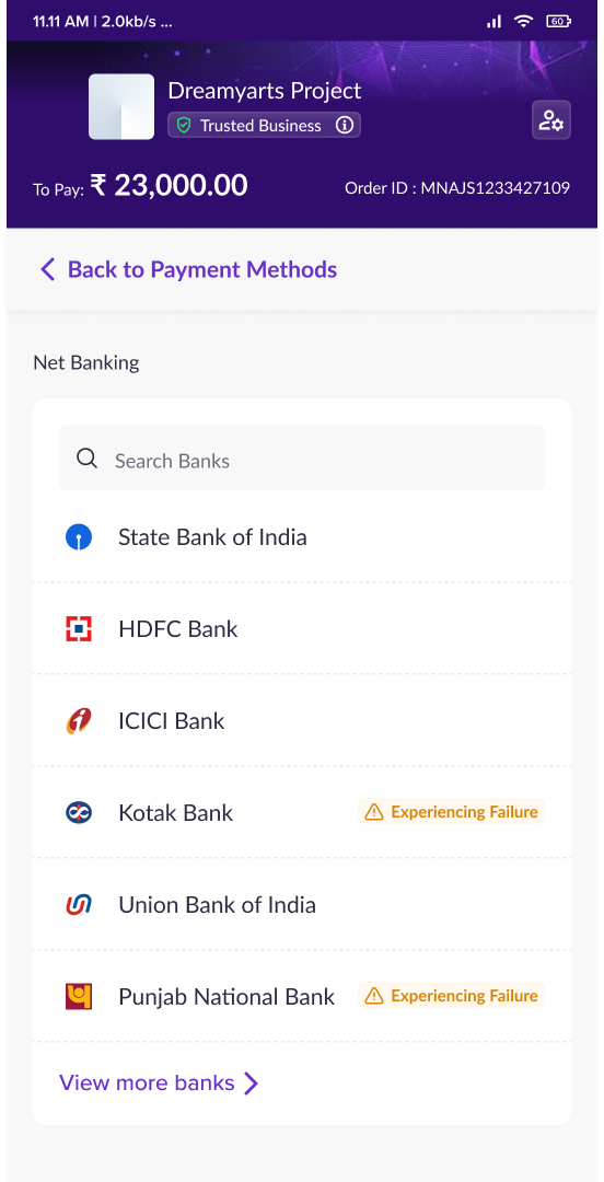
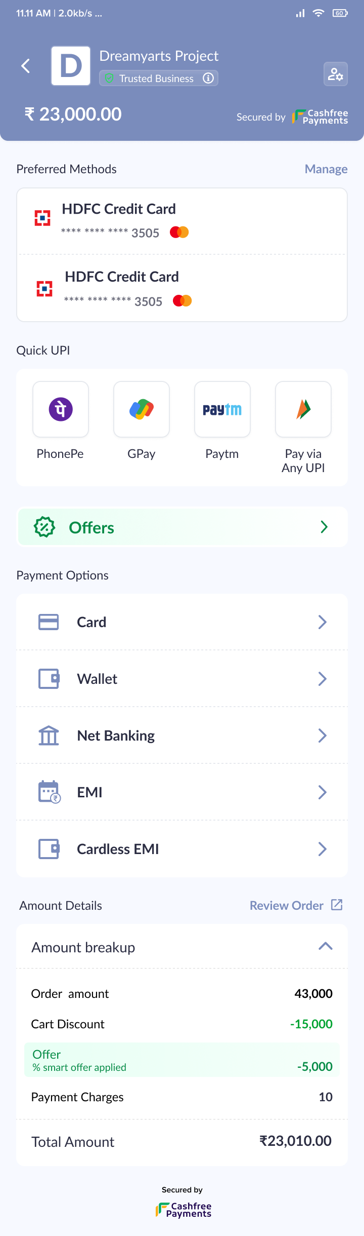
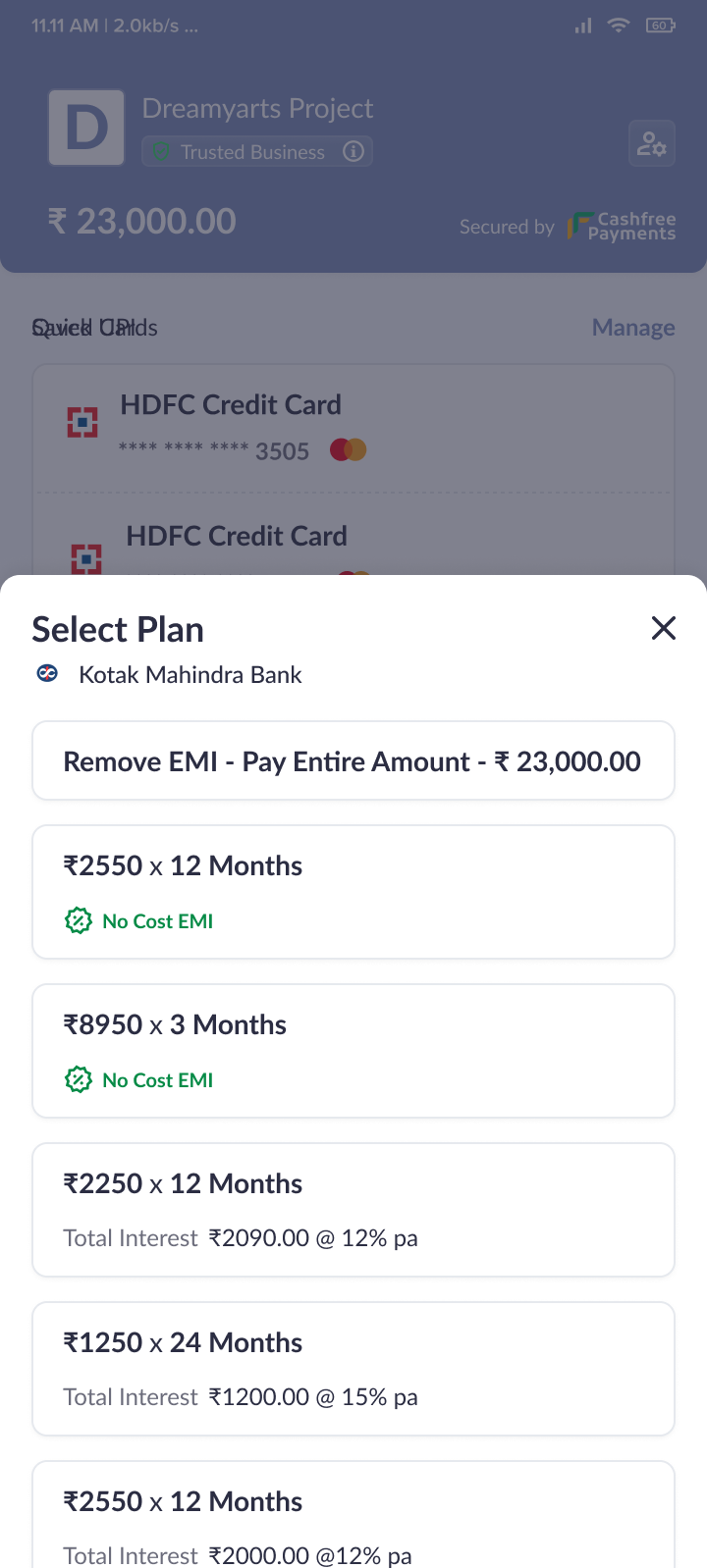
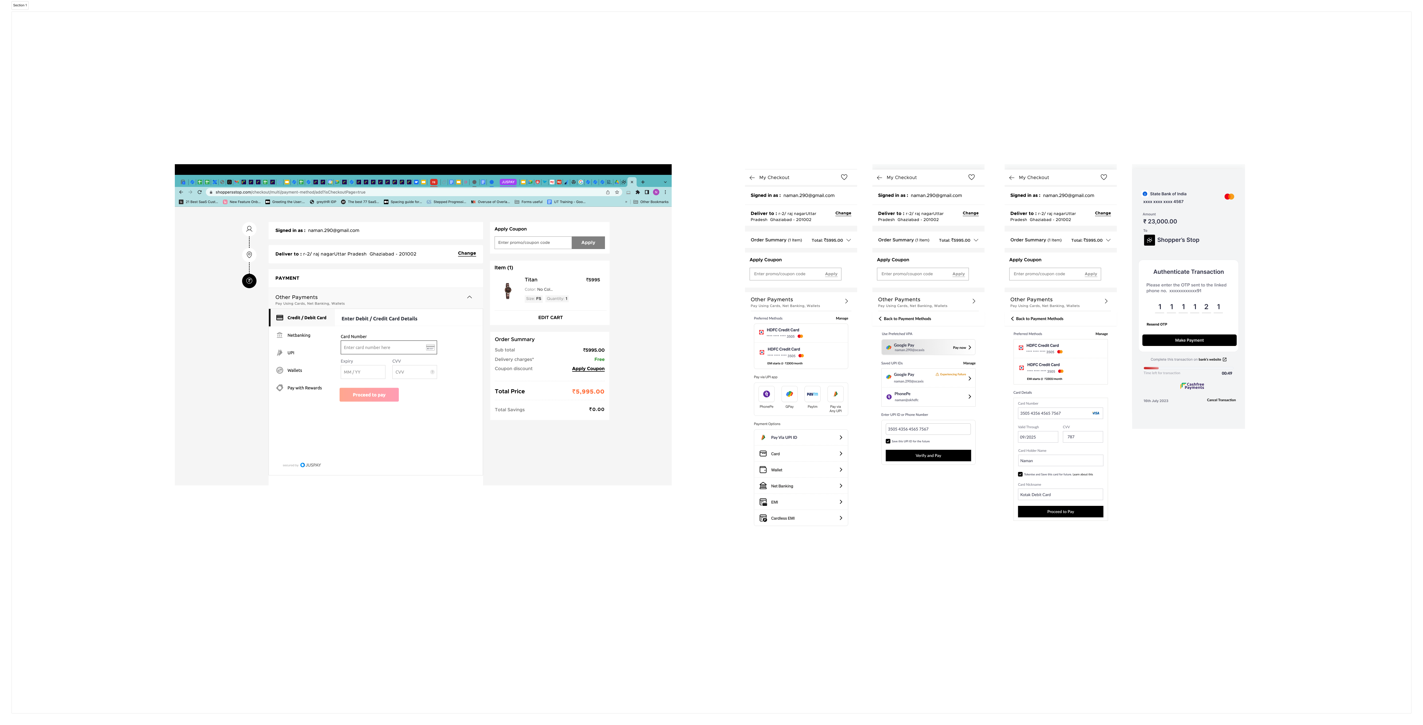
Final designs
After a little more polish , we finally had the design for our checkout
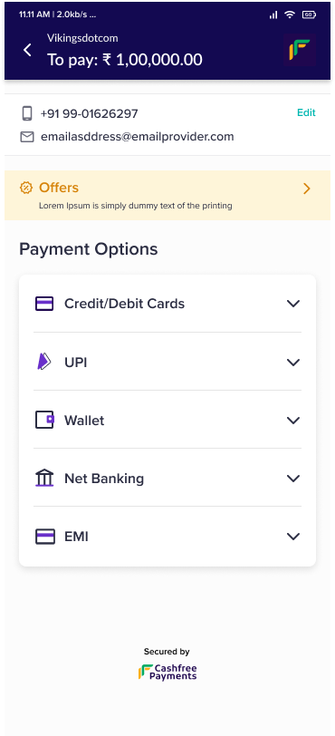
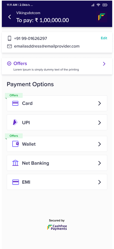
Improvements in the new checkout
While there are a lot of improvements made between the old and the new checkout, these are some of the main improvements in the new checkout
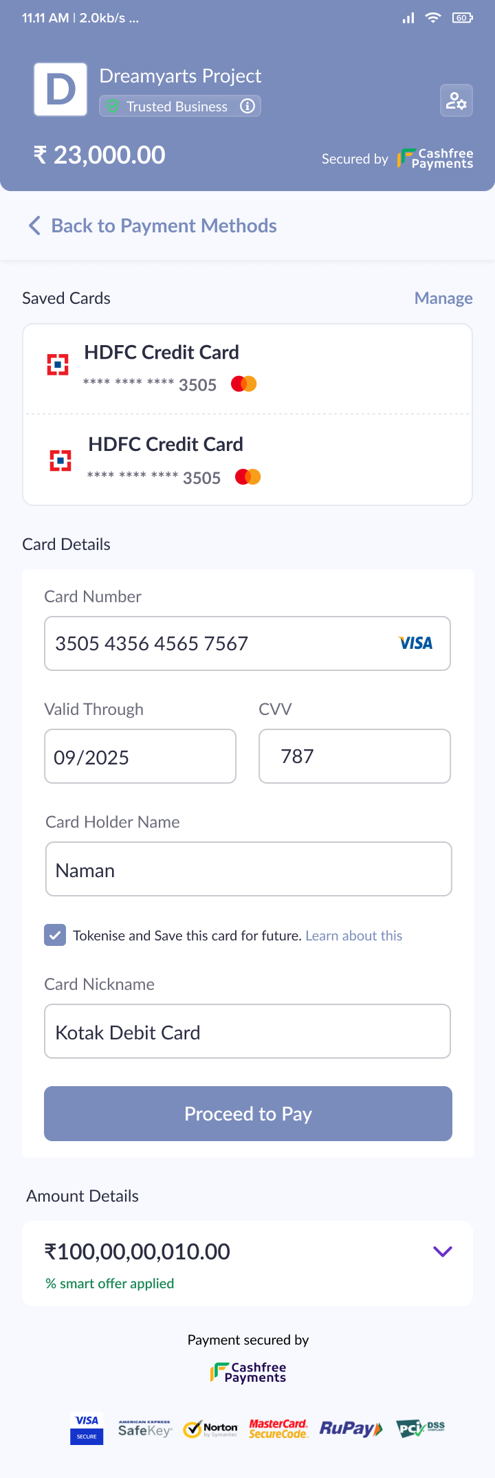
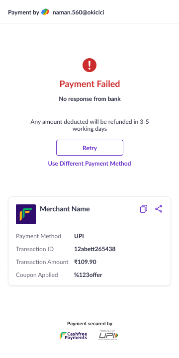
- Maintaining context : The new checkout always calls out amount at every page, and you can see breakup before you pay, ensuring least confusion. WSe also call out offers, incidents , tpv and tdr contextually.
- Comprehensive preferred payments : New preferred payments will include other payment methods
- Distinct payment flows : Payment flows are unique pages ( On mobile especially ) allowing more intricate flows and focussed payment experiences.
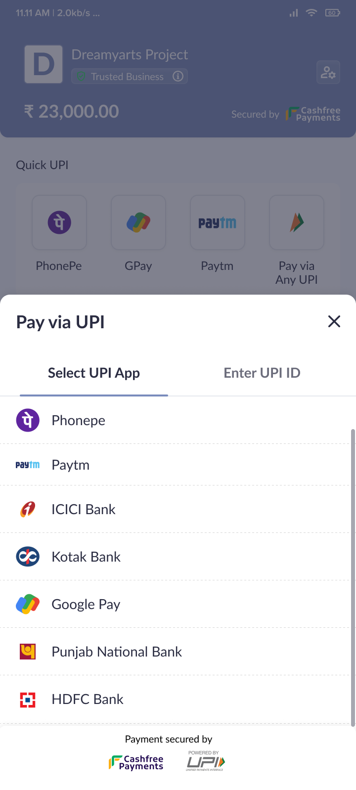
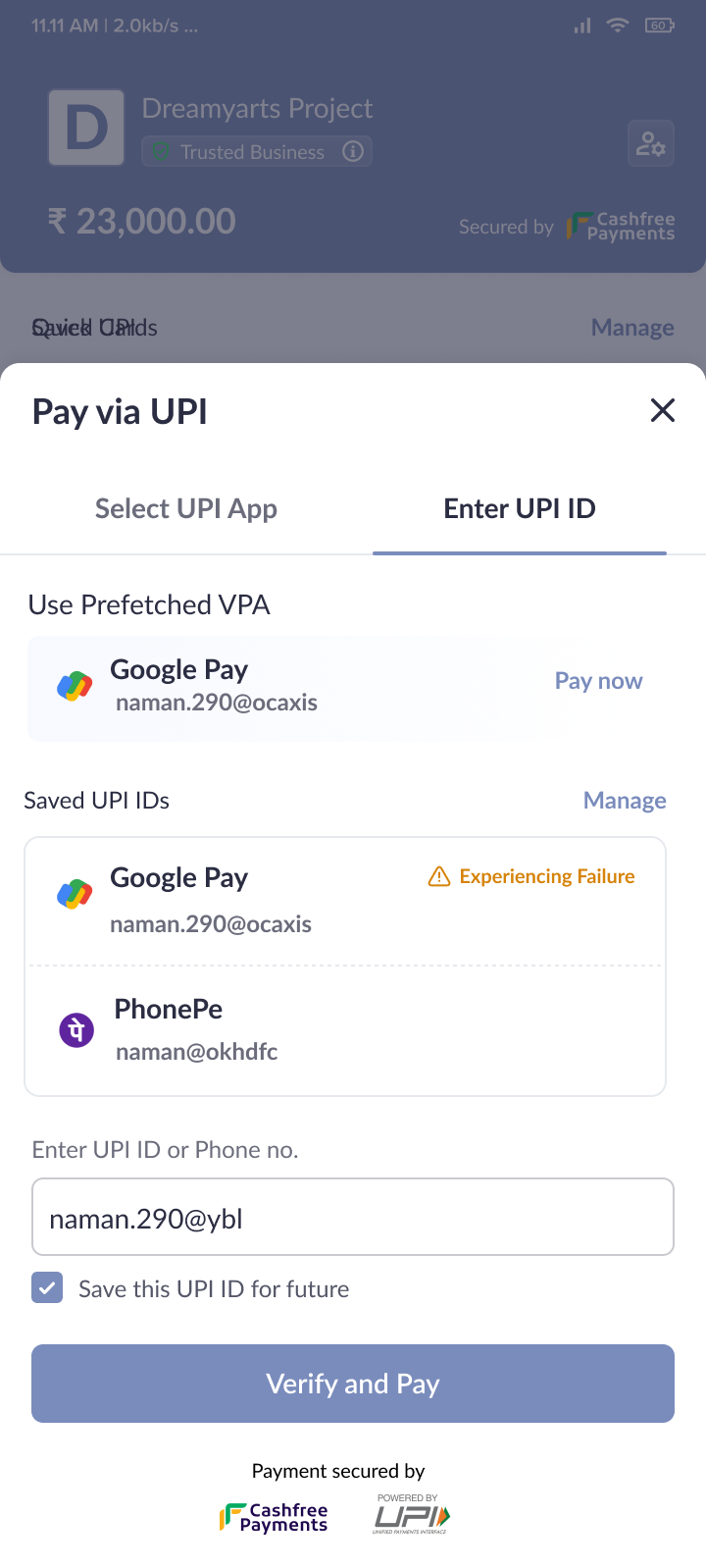
- UPI first checkout : With 80% payments happening through UPI , we ensured that reliable UPI options were given the most focus ( faux predictive approach, where data drives the ordering of the payment methods)
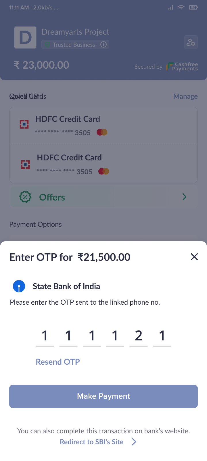
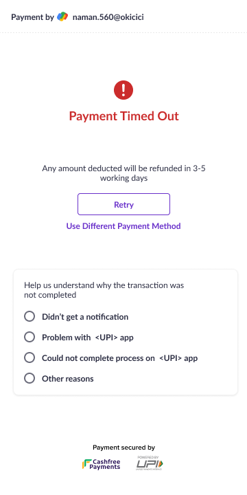
- Graceful failure recovery : Depending on the error type , we give the customer relevant information or we collect contextual feedback. Always giving the customer the ability to retry
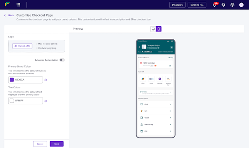
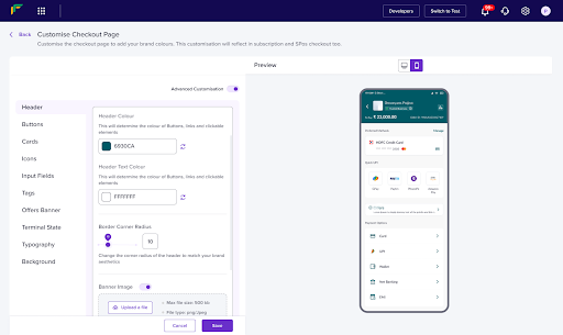
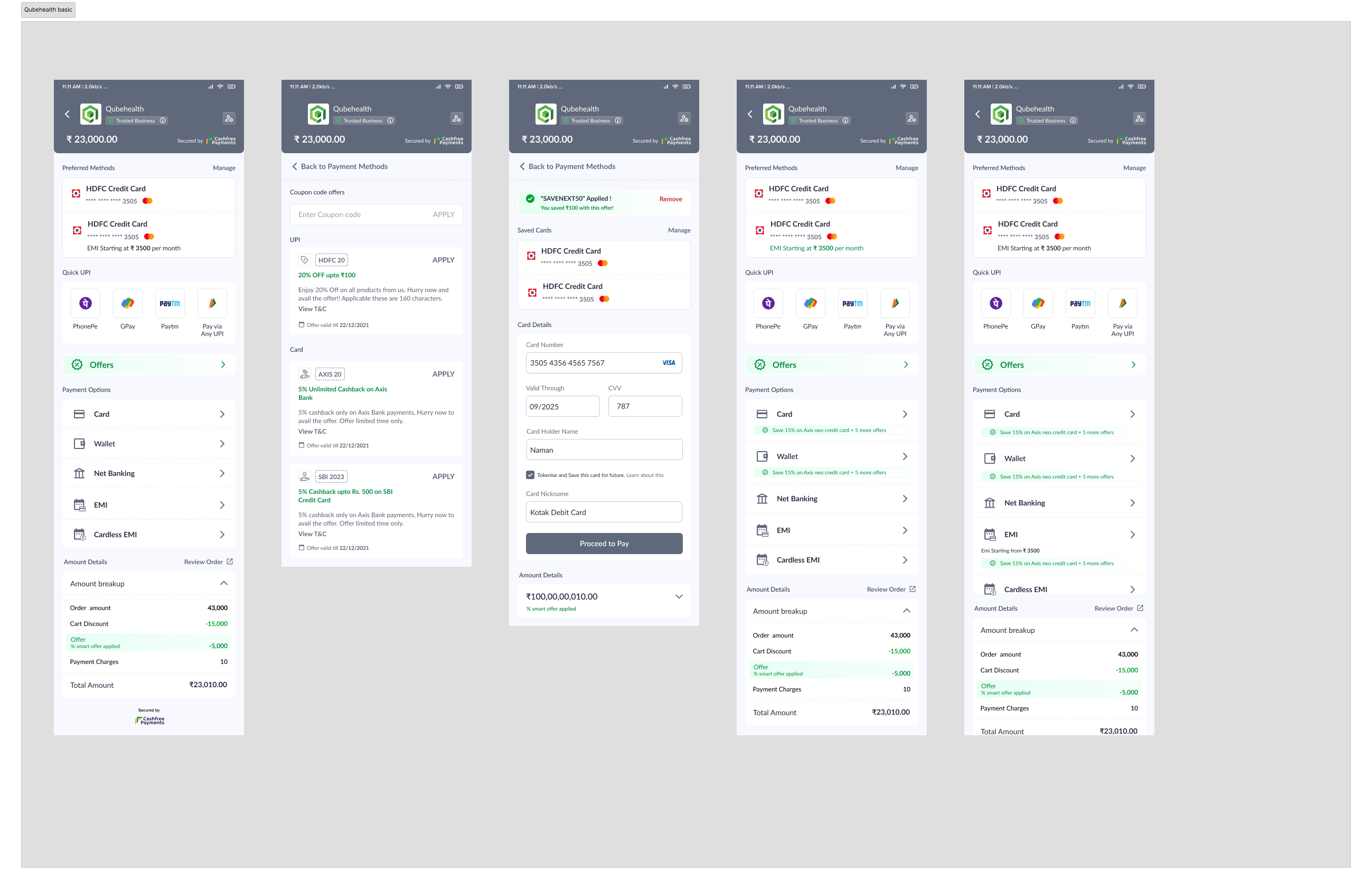
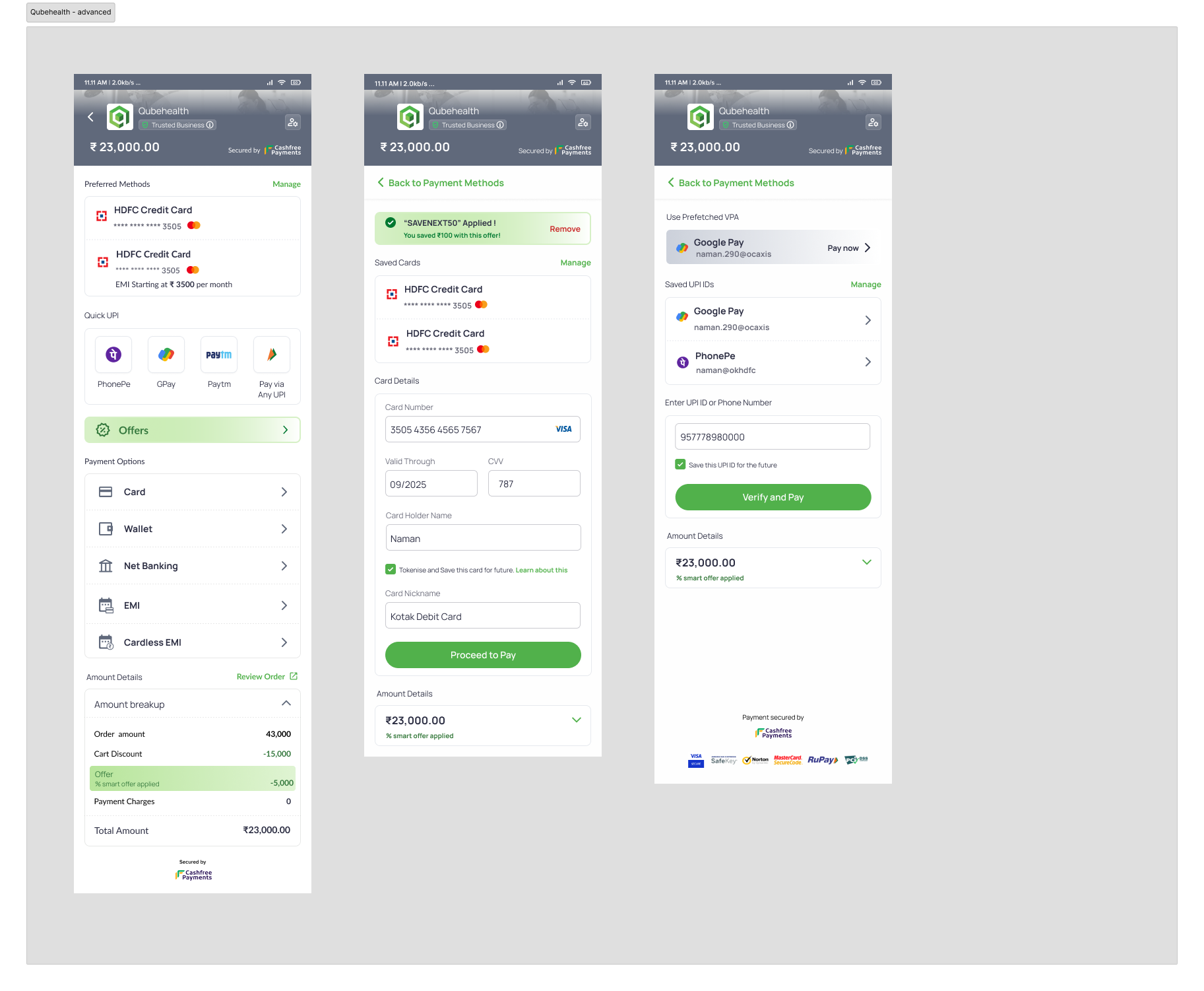
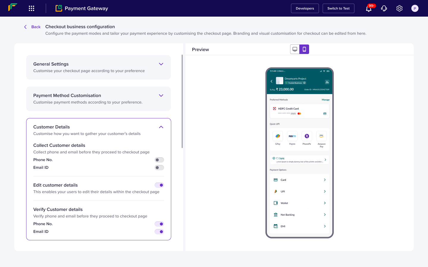
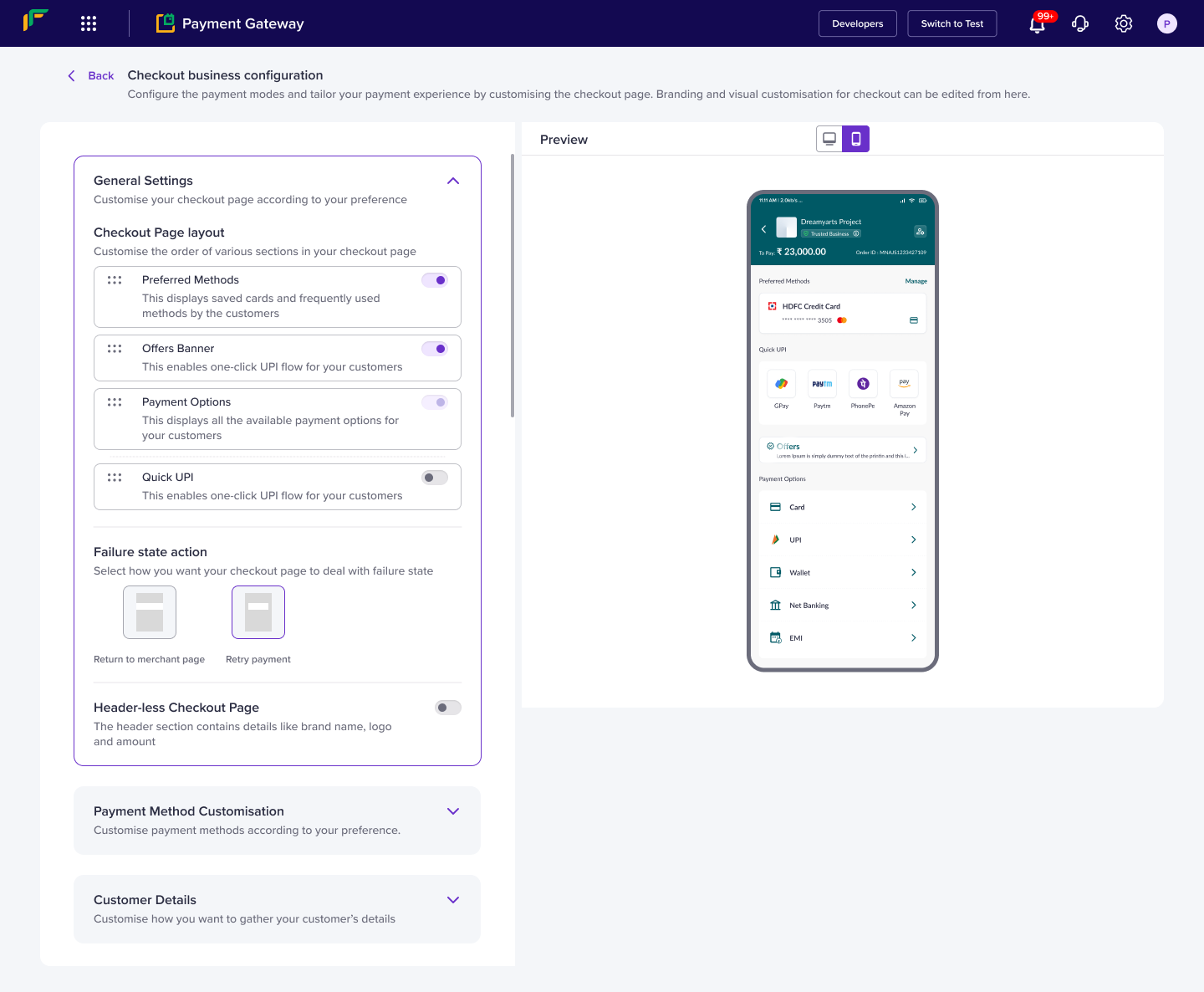
Customisation suite
Once our checkout was done , we built a customisation suite so that any merchant could make the checkout theirs. While we could use data to drive our decisions for the new checkout designs, for customisation requirements and value we looked at requests and user feedback. We conducted a cold calling exercise with our merchants to understand their needs . We called 12 customers across various GMV’s and line of businesses
Results of the cold calling
- 5/12 customers had no idea of customisation had no idea about customisation or had not revisited it post initial deployment
- 3/12 customers we called had business specific use cases which required customisation of payment methods
- 2/12 Customers wanted detailed customisation
Final approach
Since some enterprise customers had specifically requested detailed customisation but our smaller merchants needed only simple customisation, we created a 2 layer visual customisation interface. We also created a specific business customisation interface.
Conclusion
In the end the redesign gave us a checkout with the following salient points
- Multi level customisation
- Improved payment and success rates ( Increase of upto 10% )
- Enhanced merchant branding
- Enhanced customer and merchant experiences
and a lot more
This project took almost 6 months, and was a team effort. Naman Bhatia was as responsible for the final outcome as I, with every pixel being either mine or hers. Anchal Mittal , worked on the offers section, and Prachi Gautam helped us out with all the visuals.
![Exploration into Interrogative HCI [Looking at query builder UX]](http://www.nikhilshivpuja.in/wp-content/uploads/2022/04/qb1-320x240.png)